Digital Content Design Strategy
When I started, Chief didn’t have a content strategy for their mobile app or website. The digital platform was rooted in copywriting, instead of UX writing or content design.
How might we align executive leadership team on a content design strategy for the digital experience that encourages members to show up as their authentic selves?
Role
Responsible for content design strategy; sole owner.
Stakeholders
Chief Product Officer (CPO)
Chief Tech Officer (CTO)
Chief Marketing Office (CMO)
Director of Design
Director of Brand Marketing
Duration
About 1 year, from start to alignment
Research and sentiment
The audit
An audit of the current website and app were needed before starting off on the strategy. Rooted in principles from Nielsen Norman Group, I mapped out where Chief fell on the 4 dimensions of voice and tone, as well as where they fell amongst competitors and other lifestyle brands.
Rooted in my knowledge of localization, accessibility, and inclusion as well as in extensive research backed by the Nielsen Norman Group, this effort started off with an audit of the current website, and a member segmentation study to gauge current sentiment.
What members were saying
Member sentiment was low, and from our segmentation study we found that:
Members wanted personalization and a friendlier voice from Chief across the platform. The overuse of formality had members describing the Chief experience as “cold.”
Members switched to more informal apps for less formal conversations as Chief wasn’t seen as a place that fosters socialization.
Outcomes
From the research, I knew I needed to present a full-blown strategy and implementation plan to our ELT in order to help mitigate the current sentiment and set us up for success in the future. With all this research in mind, I figured out the next steps for strategy.
The strategy and focus areas
Voice and tone principles
With research in mind, I focused on creating new voice and tone principles for our digital experience, and addressing the amount of delight our platform should use. These two areas created the most impact, without the need for product design.
Defining delight
Plan
Based off of competitor analysis, suggest a new level of delight for digital
Things considered
SoHo House and AirBNB commonly referenced by CEO and CMO as ideal apps
Chief’s mission leans professional, not social, so delight should reflect that
Audience demographics should be taken into account, as youngest members are still “elder millennials”
Plan
Based off brand values and marketing principles, define four voice and tone principles for digital
Things considered
Digital principles and brand principles should complement each other, not mirror
Our brand centers around a sense of exclusivity, but our platform should feel anything but
Some visual examples
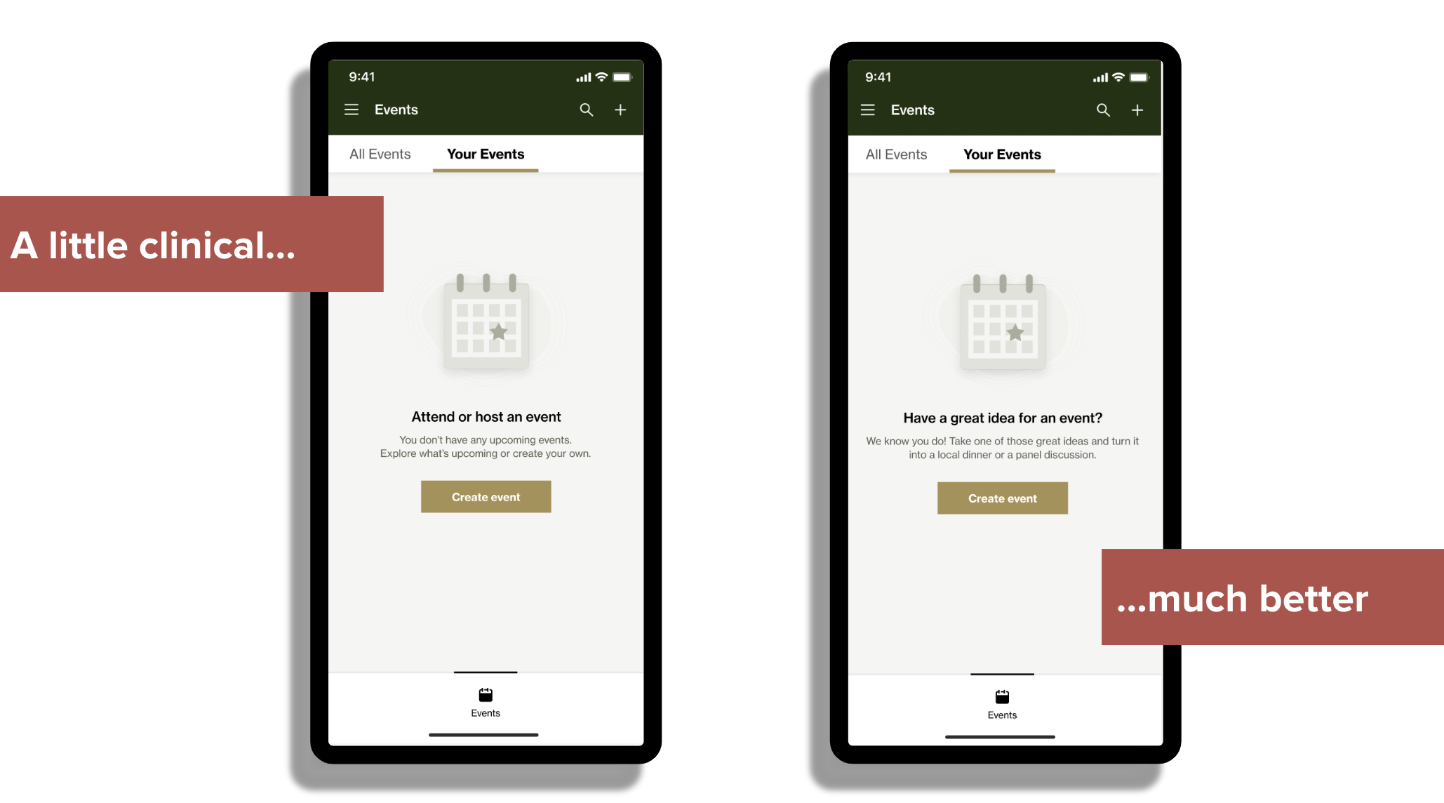
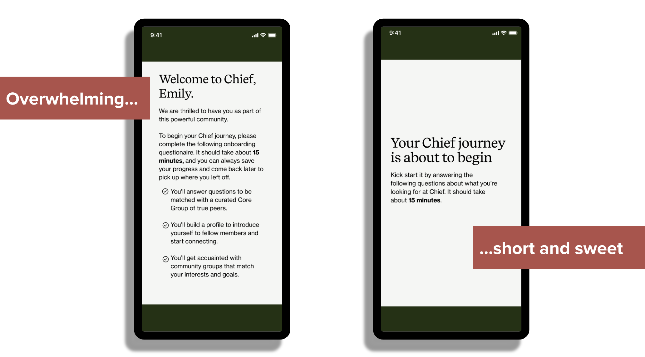
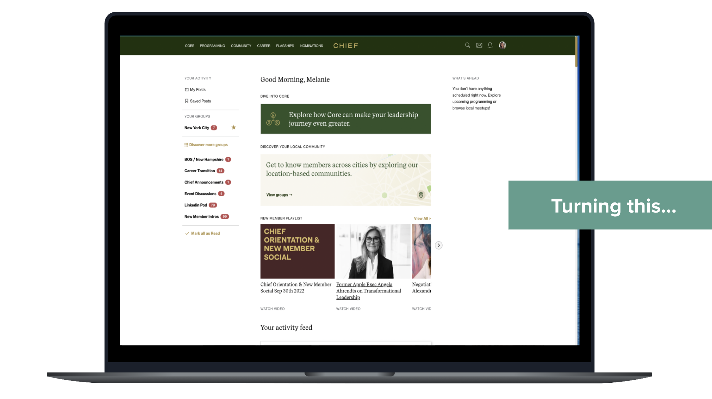
Sometimes seeing something visually can help clear up next steps, so for the ELT I showcased some of the more lackluster areas of our site and shared how we could clean it up following these new voice, tone, and delight principles.
Taking the content strategy and pairing it with the Ada Interface System look and feel (our design system) really spoke volumes.
Alignment and implementation
Implementation plan
Implement new strategy into Ada Design System to mirror new look and feel with new voice and tone
Retroactively add delight to more lackluster areas of the app or ones where more celebration is needed (event creation, job board)
In hindsight, I wish I would have presented an ENG plan for implementation. The net steps for the CTO and I included discussing with Engineering Managers on retroactive implementation of this strategy to lackluster areas in the platform. I wish I would have preemptively done that work so it could have gotten feedback, and moved forward more quickly.
Walked away from ELT discussion and presentation with full alignment, with the caveat being we slowly and methodically implement (based on my recommendation).
What I’d do next time
Content design sprint or workshop with ELT
While the pitch and proposal were well researched and backed in our brand and members, I would have liked to lead a workshop with our ELT. This way, we could have dug deeper into future hopes for Chief and reflect those hopes into the final strategy.
A/B testing with member base
While this work was done based on an extensive segmentation study of our members, I would have liked to pressure test more of our “before/after” scenarios with members to gauge response.
Chief’s IA Redesign
Chief members struggled to find features on the digital experience due to inconsistency, lack of discoverability, and misaligned prioritization causing frustration and disengagement.
How might we make it easier for our members to quickly find features and discover new ones while increasing our weekly active usage (WAU) on our platform?
Role
Lead (and only) content designer
Team
1 product manager
4 product designers
30 engineers
Duration
5 months, from discovery to implementation
Constraints
Legacy terminology
Timeline
Engineering resources
Research and sentiment
The method
We launched a card sort with 18 members to get their mental model on how to approach our initial groupings.
We had limited time, so our sample pool was small, but it allowed us to get a great jump start into our design explorations.
Overall, our member sentiment was low. Members were struggling to find what they needed, when they needed it. Which is especially problematic when you’re an executive short on time. We ran research at the start of this project, and again to validate our design decisions.
What members were feeling
IA, by definition, is a content design issue. For a part of this work, I wanted to make sure we were measuring member sentiment and emotions to give us guidelines around what we created. Members were feeling:
stressed that they couldn’t get into events on time
annoyed that our platform was this finicky
overwhelmed by how much we (seemed to) offer with our navigation
Outcomes of research
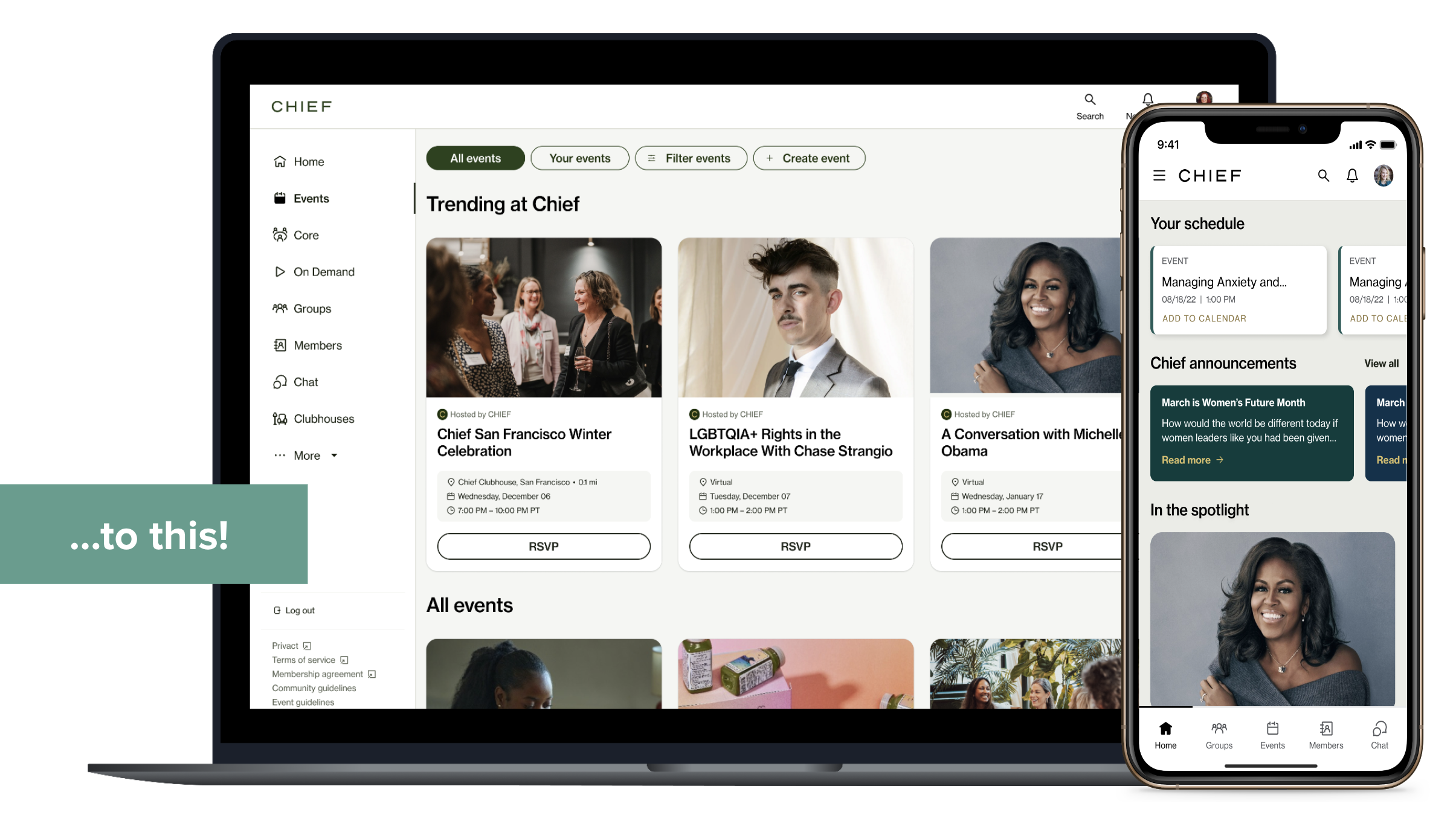
There were 6 main groupings that came out of our research, minimizing both our mobile and desktop nav
Members thought of events and meetups (distinguished things previously) as the same thing
Members prioritized connection and people, wanting our member and group sections to be easier to access
Strategy and plan of action
Hierarchy
How can we prioritize features and tools that meet our members’ where they’re at?
Plan
Sort features based on member value and platform
What we did
Moving “on-demand” out of the events space to for quicker learning access
Prioritizing certain features on each platform (chat on mobile, event creation on web) to boost engagement
Condensing community groups and activity feed into one, people-oriented space
Information architecture can be a monstrous content design problem. For MVP, we focused on hierarchy, navigation, and labeling as they were areas where we could give the highest impact within our short timeline.
Navigation
How can we guide members to the right things, at the right time?
Plan
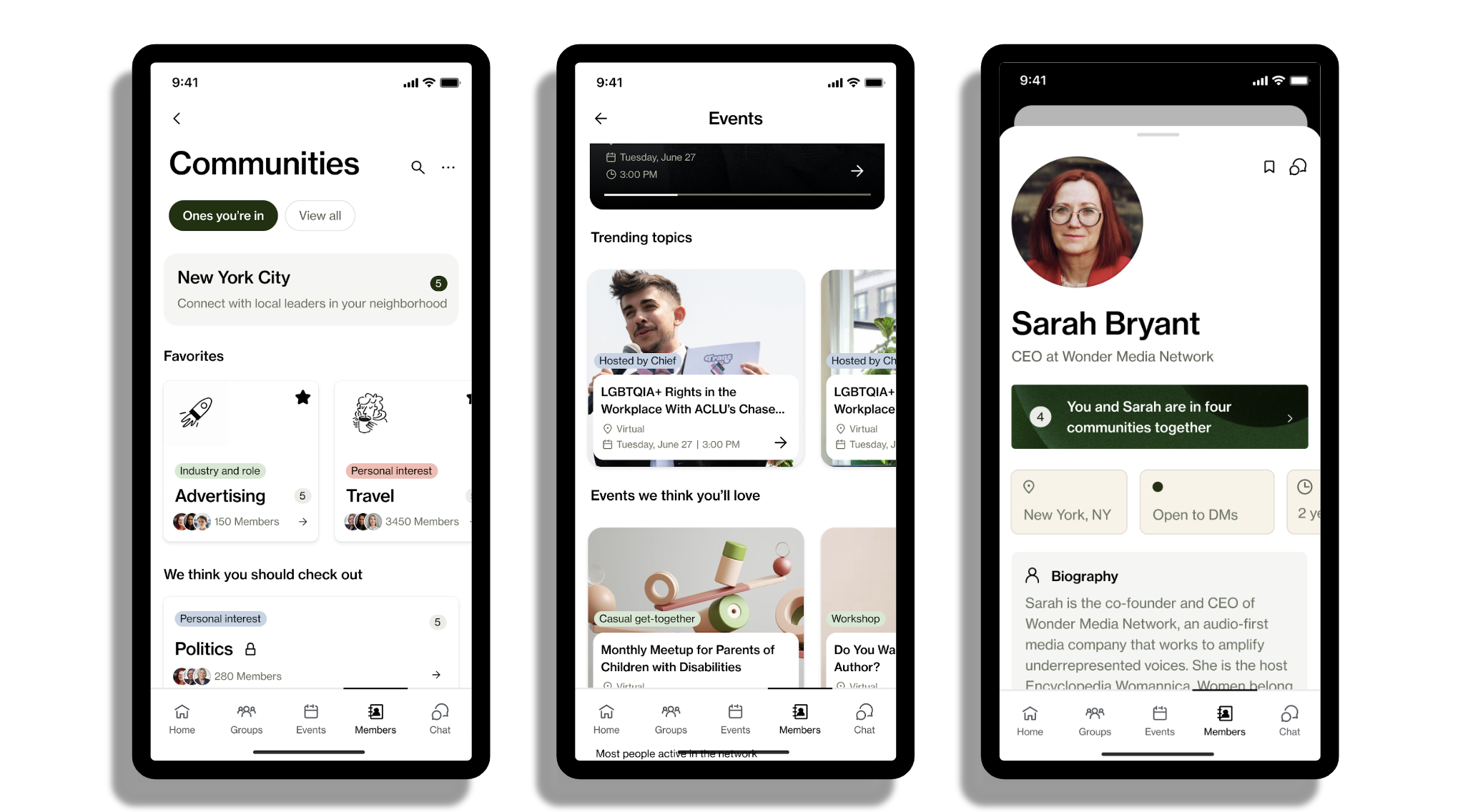
Consolidate two navigation bars into one left-side navigation for easier access and more exposed options
What we did
Prioritize events and learning by stacking events, on-demand, and Core up top
Organize mobile nav to focus on five main areas: Home, Groups, Events, Members, Chat
Consolidate miscellaneous pages into dropdowns or under Profile where it makes sense (Nominations, Job Board)
Labeling
What language resonates most with our members, so they’re not confused or unclear?
Plan
Use language that resonates with member base
What we did
Merge events and meetups together, all under the term “events”
Switch terminology to meet member language:
Rolodex switches to members
Flagships switches to clubhouses
Careers switches to Job board
Validation and overall thoughts
Validation
Due to time, we used a lookalike audience on User Testing to test our final designs. All 19 participants were able to complete the tasks given to them—a big win considering our starting point.
Naming conventions were our only hiccup, with participants being confused by internal features (like Core). We expected this, and noted it as something to test with our internal users in the future.
We had a 45% sustained increase in app views since launch. Our digital WAU remained the same, with a slight increase on launch week. Our hypothesis is that due to seasonality (summer is our lowest WAU, and we had a June launch) our WAU didn’t reach our intended goal.
What I’d do differently
Pressure testing narrative with members
While lookalike audiences are great in short timelines, I would have focused more on working with client services to send out a broader survey for A/B testing on different variations of similar screens.
Personalized views based on onboarding
Instead of letting member onboarding data go to waste, use provided goals and outcomes to tailor home screen into one that suits their needs. For example, if they value networking, prioritize people over events.
Chief’s Executive Coaching
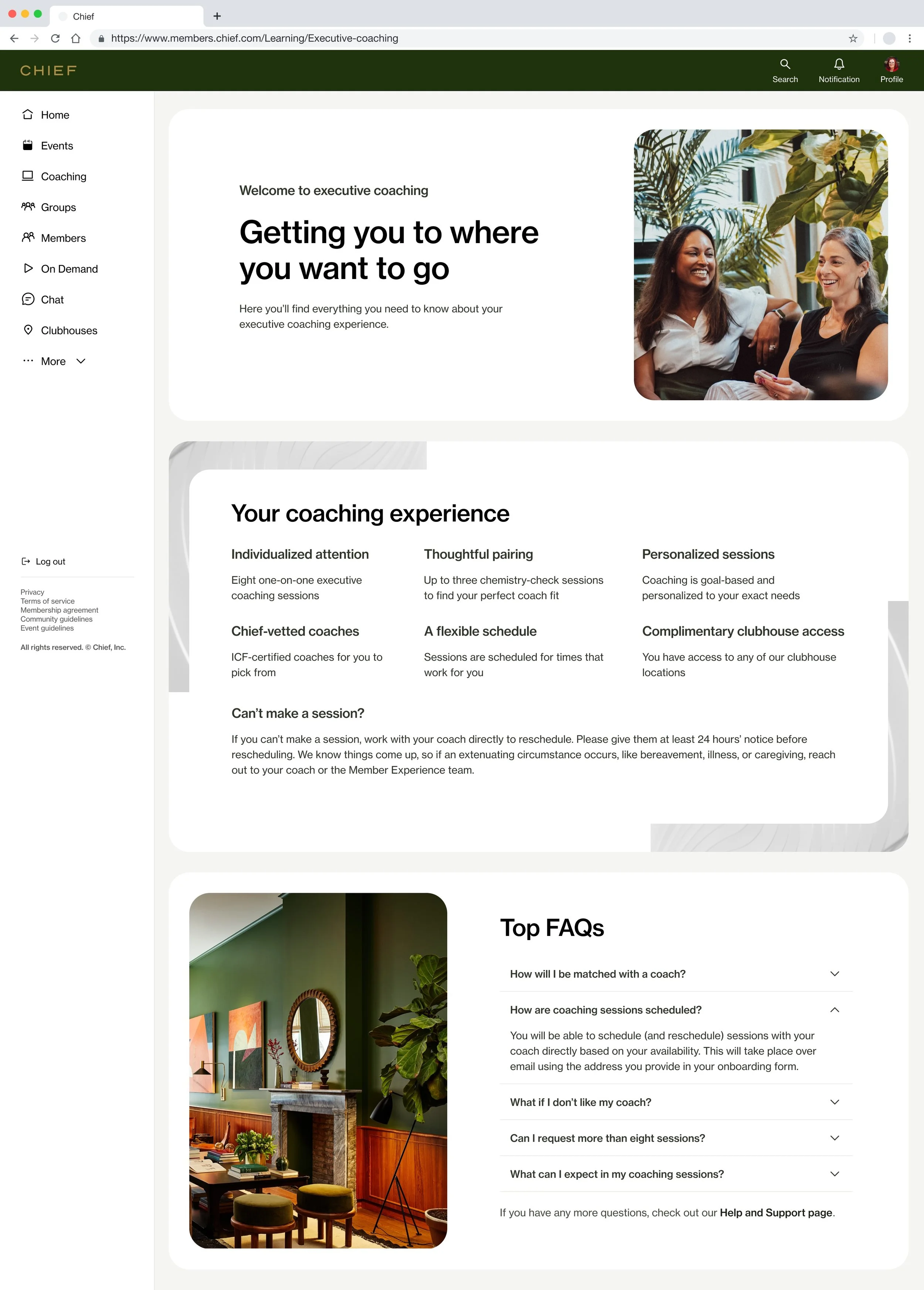
Chief members were getting mixed results from their Core coaching groups, leading to frustration and Core drop out. Our membership team launched the idea of executive coaching to our members, and there was high buy-in.
How might we inform our membership about the new executive coaching offering, and create a space where they find the information they need while we work to create a more dynamic dashboard?
Role
Lead (and only) content designer
Team
1 product manager
1 engineering manager
1 product designer
6 engineers
Duration
1 month, from discovery to hand off
Stakeholders
VP of marketing
VP of L&D, and the entire L&D team
Strategy and plan of attack
Things considered
Voice and tone needed to be clear, engaging, and positive. Our members tend to have a lot of questions, and we wanted to mitigate some of that.
Our new landing page needed to be visible to all member who opted out of Core coaching groups.
Most coach-to-member communication would be done via email, with hopes of creating some more actionable items for fast follows.
The final result
Member interest for executive coaching was beyond high, and with our business needing a little love, our strategy revolved around unlocking key actions for our members, while creating a scalable design for fast-follow features.
Emotions to watch out for
Because this was a new feature, and members couldn’t be in Core with it, there was a possibility that we could get some negative feedback. Our members know what they want, and aren’t afraid to speak up to the Chief team.
Frustration: Need to explain why it’s Core OR executive coaching to mitigate frustration.
Confusion: Need to be clear and concise so they know what they are getting.
Because of the short engineering timeline, the goal of this page was to inform, rather than give actions. An encouraging tone was used (rather than pure excitement) to balance the professional nature of our network with the human joy of a new opportunity.
Questions still needing answers
Is there a future where members can opt in to Core coaching groups and executive coaching? If so, what does that look like?
What actions do members want to be able to do from the landing page?
How do coaches want to communicate with their mentees, through Chief or outside of it? Do we need a coach portal like we have for Core guides?
Challenges and next times
Stakeholder alignment
The new VP of marketing really wanted to use this page as a “sell” for this feature, rather than a post-opt-in landing page. It took two sessions, but what her and I found out is that she was more worried about not being seen as professional if our language was too casual.
I balanced this concern by using delight in a more mindful way; picking phrases that resonated (Getting you to where you want to go) but weren’t too giddy (Let’s get you going!).
While beyond pleased with the MVP phase of this work, it wasn’t initially easy to get to. Marketing stakeholders felt strongly about how to speak to this new offering, and it took a couple collaboration sessions with the VP of marketing to get alignment.
There’s always next time
I would have loved more time to get the dashboard view up for MVP. This landing page didn’t feel as complete as I would have liked for MVP, and I know my product design partner felt similarly. Next time, I’d dig a little deeper with the engineering team to see if there was anything else we could fit in (that felt more dynamic) while sticking to the non-negotiable ELT timeline.
Fast follows
Unfortunately, Chief had lay offs before this implementation, but our slated "fast follows” were:
Dashboard view 1.0, with the ability to message coach from home page
Coach bios
Space for notes and progress tracking communication between member and coach


